
LA28 Superbloom
by J.D. Connor
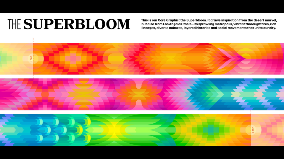
LA28, the folks running our Olympics, released their “Look of the Games” design package last month. You don’t need to know that it grabbed much of its palette from L.A.’s 1984 Games, and you don’t need to know that they called the whole thing a “superbloom” because wildflower eruptions are the best PR Los Angeles has right now.
via LA28.org
What you do need to see—because if this thing works, it will change the way the world looks for a while—is the how and why of its screen-first, tessellated glissade of a design. Imagine the work that went into this graceful buck-and-wing. The labor and the grace. Against Trump’s gilded bloat; against the febrile jingoism of red-white-and-blue; against the stripped-down Nazi classicism of 1936: this is new. A “continuous loop” that is neither the doom loop of a city in inevitable decline, nor the goon loop of the Führer’s minions.
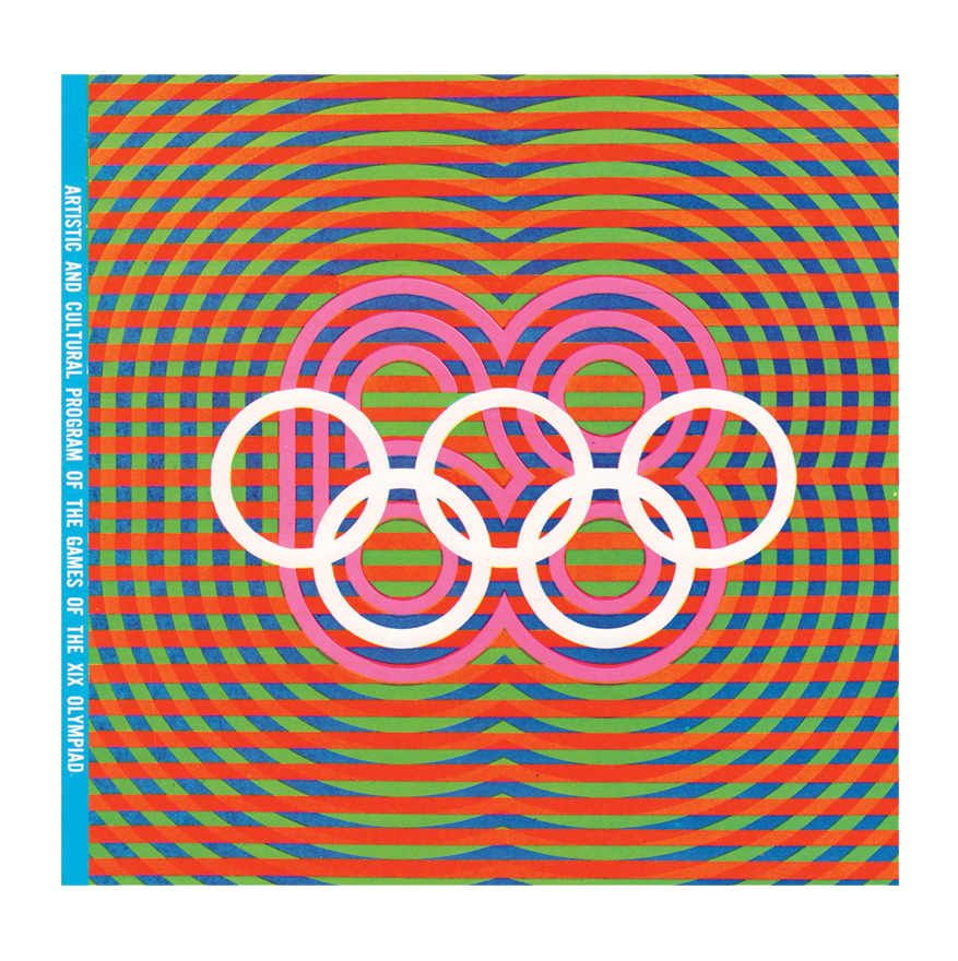
Olympic design programs usually vanish with the Games, but there is a chance that this one will stick. Imagine that: it might be good enough to bear comparison with the look of Mexico 1968, the best-looking Games design ever.
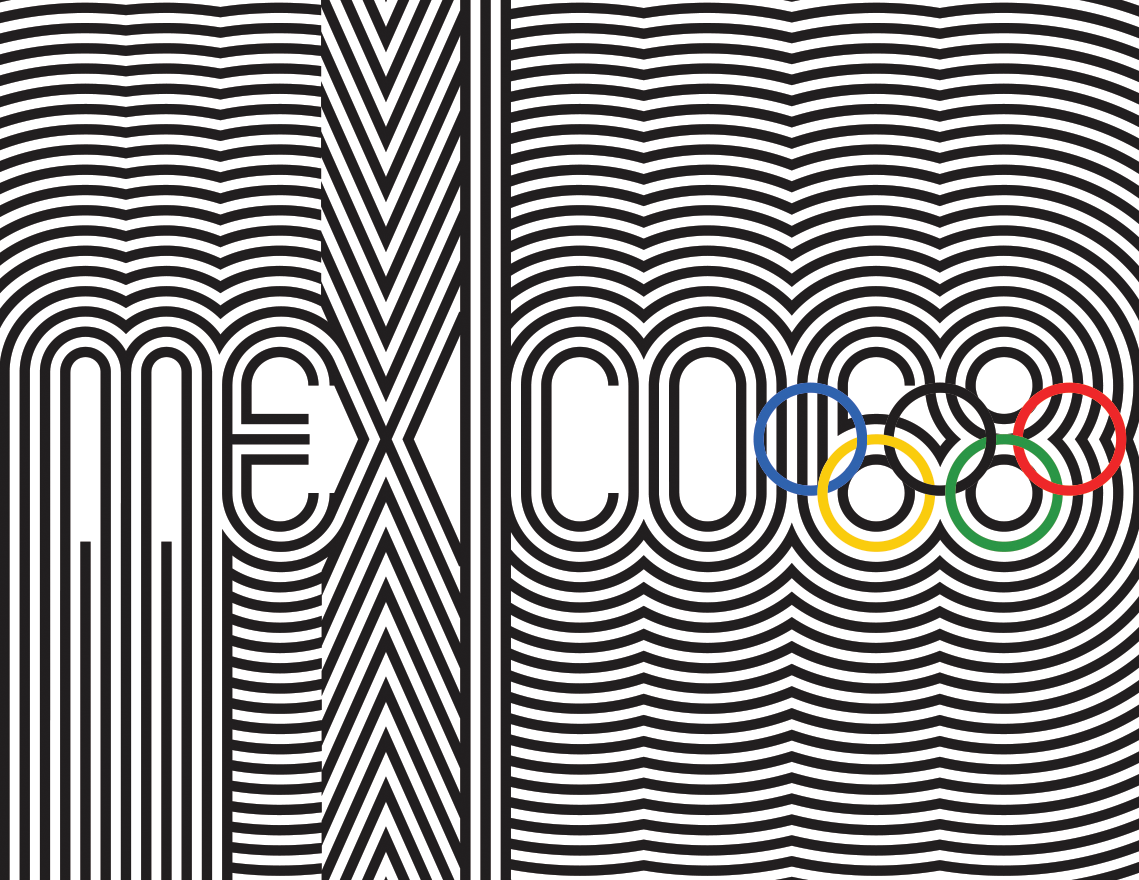
The Mexico City graphics remain astonishingly cool. Executed just before the heavy constraints of brand bibles would descend on these megaevents, the 1968 design vividly, relentlessly pops. Op art vibration, saturated colors that belonged on miniskirts not flags: an ode to a modern Mexico that styled itself as consciously pre-Hispanic, pre-colonial, the first games for the global south. (Melbourne ’56 doesn’t count.) In the midst of a Latin American literary boom in the North and a planetary space race, this was Aztecofuturism. It owed a lot to designers Lance Wyman (New York) and Beatrice Trueblood (London via New York), but their efforts seemed less like exoticism and more like finding their way into the current.
Keep us breathing fire!


For $3/month you can read this whole post and get our weekdaily newsletter too!